Kinfolk App: Never Miss a Moment
I helped to develop the Kinfolk App together with Victoria Robinson,
Padraic Cassidy,
and
Maribel Castillo. We’ve observed that social media platforms that may have been originally intended to keep people connected have become overwhelming with lots of information, arguments, surface level motivations (i.e. caption focus, influencer, followers based, politics, etc.). For families especially, this has become a thorn to staying connected with those they love because of several reasons, including the fear of comment spiraling or simply don’t want to share personal moments on these platforms anymore.
Kinfolk: Never Miss A Moment
-

10 Interviews
We found that users of social media had some pain points. People had a fear of missing the moments in their families lives. These same users think that social media can be a time suck. They are also weary of their controversial family dynamics that surface on social media. Older people also struggled with the technology involved with connecting with social media.
-

Survey
Participants: 247; Demographics: Ages 18-72+
KEY FINDINGS
68% spend 1-6 hrs/week connecting with family
~90% use social to connect with family
Less than 11% of respondents use social to connect with older generations
Most used channels are Facebook, Instagram and Group Text
91.5% interact with photos mostly
-

User Flow: Creating a new personal album
With user research and ideation completed, we started to focus on our user flow. We determined what main features we wanted to focus on and envisioned what our User Persona would find most beneficial when connecting with her family. The features prioritized included joining a family by special code, posting and reacting to photos with voice memos, viewing featured family albums and creating personal albums. Each of us took a feature and developed our flow.
-

Paper Prototype
We ultimately wanted something that met our users where they were. Having an app that was easy for all ages and all families was key in our design. Building connections for all ages and skill level.
-

Digital Wireframes
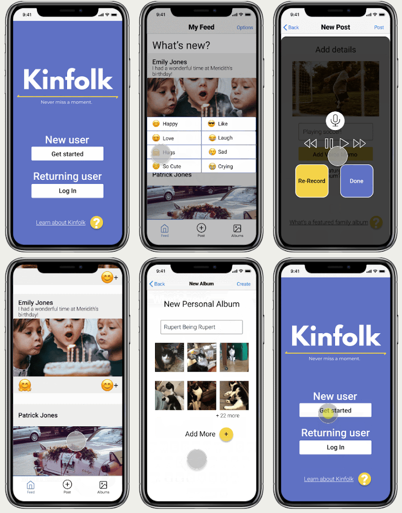
Culminating from our research, and prototypes we created digital wireframes. Wireframes that were simple, yet attractive.
-
Testing and Redesign
Key takeaways we learned from prototype testing
- Back buttons -- use the iOS title header with back button
- Update nav bar (+ button issue and consistency)
- Change the proceed button on recording page to make it clear
- create consistency on coloring
- sizing of buttons
- sizing of font
- Make the size of buttons accessible for all ages
- Change colors so people with sight impairments can read the screen
